The power of storytelling to shape and drive product roadmaps
It’s How You Tell Them
We’re visiting Ashley, a biology major two years out of college, to talk about her degree.
As we get into the conversation, we ask if we can see any documents that are relevant. She brings out a small wicker basket. It’s filled with at least 10 sealed envelopes that are all stamped with her student loan company’s return address. She explains that they’re debt notices for her student loans that come every month, and she’s been terrified to open them, so she just saves them. We ask her if we can open one together; looking nervous, she agrees. After opening the envelope, she starts to read what’s inside it aloud. And then she turns bright red and clearly becomes self-conscious, because she discovers that she’s being charged interest on a loan that she didn’t even know she had.
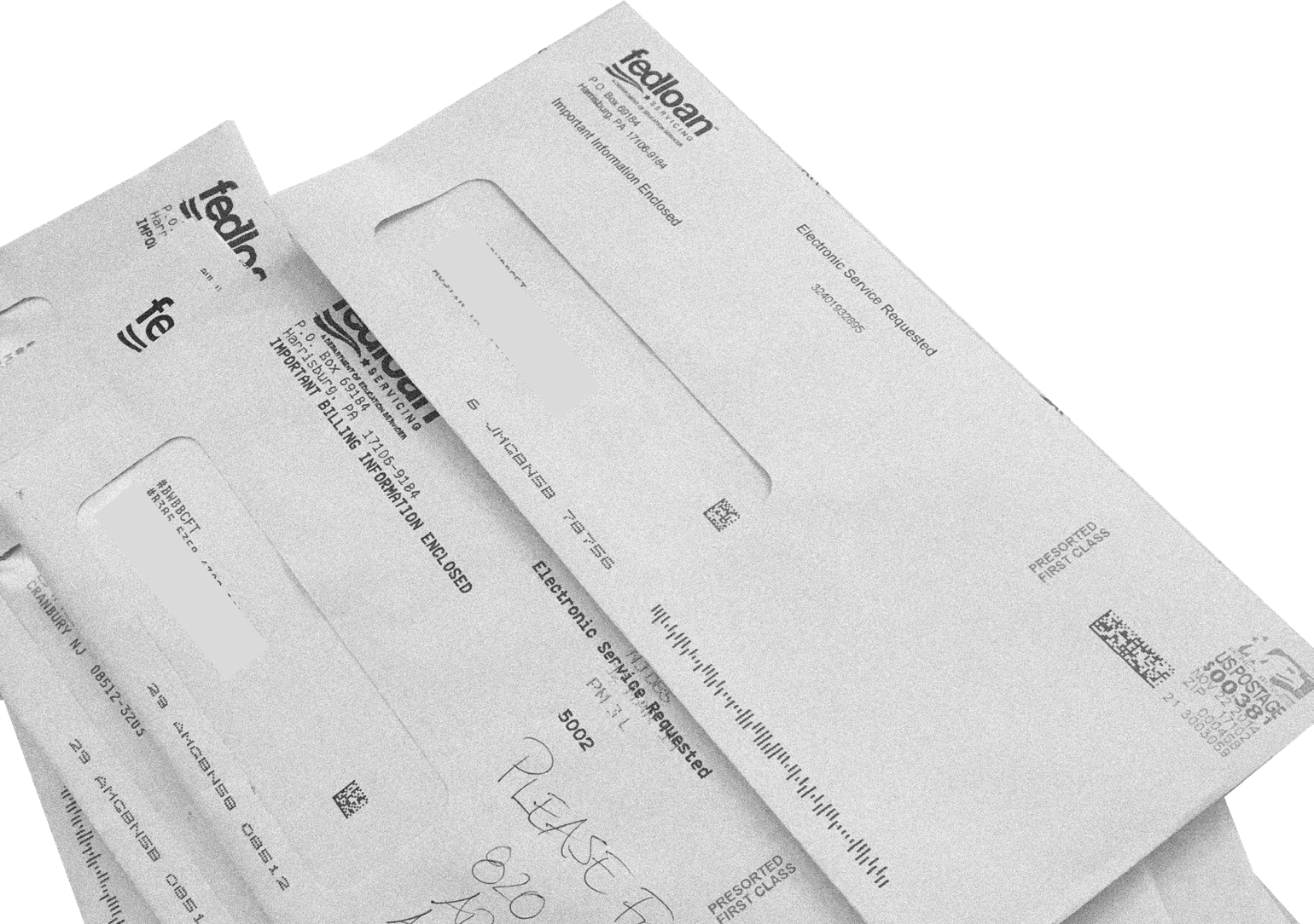
“I kept on getting these loan notices,” she explains. “I almost defaulted and I had no idea, because I was like, ‘Oh, I’ll just ignore this’. But I kept getting stuff in the mail and was like, ‘I don’t have to worry about this!’
I’m paying the other two loans I had. It was just because I had no visibility into it, like they would come and I would ... I didn’t have them automated because it just freaked me out to have it subtracted from my bank account every month—all these late payments— because I wasn’t able to manage it. I was so terrified, I had this basket full of past due notices, and I just didn’t look at it ...”
Imagine that you’re an executive from the student finance company that’s commissioned this research, and you’re watching a presentation of Ashley’s story. Even though you’re 50 years old, have no debt, and make $200,000 a year, you’re starting to see your company’s product through the eyes of one of your customers. The experience makes you think. Like any business, you want your customers to feel comfortable with using your product—you certainly don’t want to make them angry, upset, or embarrassed. Nor do you want them to be so afraid of the notices you send them that they let them pile up in a wicker basket unopened. You might then ask yourself whether you can change the way you do things so that you can help Ashley, and others like her, to have a better experience. This would be of benefit to both her and you, because she’d be less likely to default on her loan and your business would have fewer debtors to chase.
It’s easy to see that this is a persuasive story for its audience. Part of that comes from the content: the indebted Ashley realizing for the first time how much financial trouble she’s in, and her emotional reaction to the discovery. What’s less clear, though, is the element of persuasion that comes from how we told the story to our client. This is a vital element of our storytelling, because we need our clients to believe in our participants’ stories and be affected by them so that they’ll want to help them through new design strategies. Equally, we want our clients to be able to use these stories to convince other people of their worth; if we can do a good job of telling them, so can our clients with their colleagues.
There are six areas that we’ll look at as we explore the presentation of great stories:
Grabbing an audience’s attention
Selecting the best stories
Keeping it real
Skillfully combining visuals and quotes
Showing rather than telling
Knowing when and how to make insight statements
Grabbing an audience’s attention
Ashley’s tale above is a classic example of an attention-grabbing story. It’s personal, emotional, and contains an element of discovery within it (her realization that she has even more debt than she was aware of). If you were in the corporate audience for this story you would no doubt pay attention to it, if for no other reason than that you sympathize with her plight or you find it incredible that someone wouldn’t open their loan notices.
However, not all stories are created equal in this way. Imagine if Ashley had already known that she had the extra debt and wasn’t particularly bothered by it. Or if her parents had offered to pay off her loans, which meant that she could relax about the situation. Those might still have been worthwhile stories, but they wouldn’t have gotten you to sit up and take as much notice. For a story to grab your attention, it needs to show people doing interesting or surprising things, otherwise it won’t be persuasive—it’ll be boring.
Having said that, boring isn’t necessarily bad, as some of our clients are a little wary of material that prompts a revolutionary product innovation; they’re looking for more incremental change. But generally, the stories that capture people’s attention and imagination are persuasive out of the gate. They make our audiences think:
“Wait a second, did she really do that?”
Selecting the best stories
When we carry out research in the field, we usually spend time with as many as 20 to 30 people. Clearly we can’t tell each one of their stories to our clients and still make an impact, because we might only have time for two or three of them. And within each of those, there may only be the opportunity for us to make a small number of points. We have to be picky. Just as not all stories are created equal in terms of being compelling, so some stories lead more directly to a creative design strategy than others. How do we select which ones to use? This is both an art and a science.
The first thing we do when we return to the office after visiting people in their homes or workplaces is to print out the pictures we’ve taken and transcribe the audio. Then we dump it all into a Google spreadsheet, which effectively becomes a database of everything that all the research participants said and did—a huge amount of data. Next we create a card for each of the participants’ statements, with one thought or quote per card. We go to our studio wall and adhere pictures of the people, along with all their cards—this can amount toaround 5,000 pictures, papers, and sticky notes. Our entire studio is then covered with data from the research.
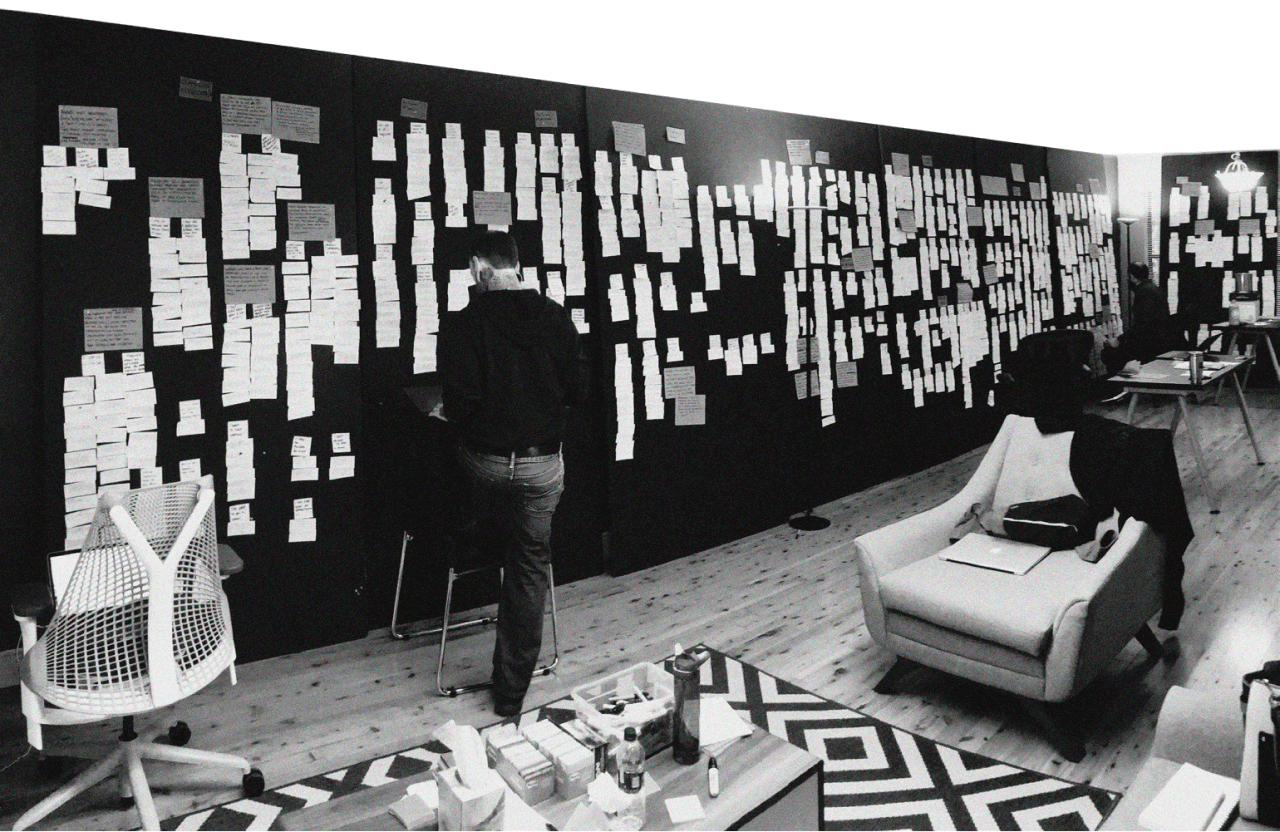
This is overwhelming, so we need to find a way of grouping and eliminating some of the data.
We begin by putting cards that seem to be related to one another into groups. The easiest and most obvious way to do this would be to group them by noun, such as “technology,” but we avoid this method.
We call this “red truck matching,” and if I give you a made-up example, you’ll see why. Suppose we have two quotes by participants about red trucks:
My dad used to drive this great red truck. I miss him a lot.
and
I bought my kid a Hot Wheels car; it was a red truck.
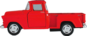
If we were red trucking we would group these quotes under the noun heading “red truck,” implying that their only commonality is that they’re about trucks that are red. That seems logical, but it misses the human elements of the statement. Far more helpful would be to group the quotes by feelings or behaviors (usually a feeling related to an activity), such as “Vehicles trigger nostalgia and emotions related to family life.” An example related to Ashley’s story, for instance, would be the label: “Anxiety and fear around paying off debt is embarrassing.”
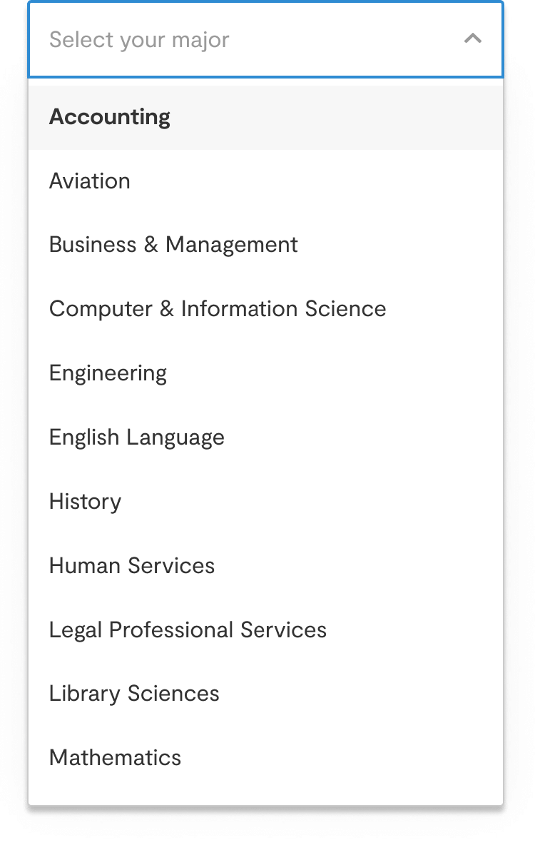
Let’s walk through a real-life example of how the process of selecting and grouping the data works. As part of some wider research into how college students make the transition from college to university, we spoke to a number of them about how they picked their majors. One woman had chosen accounting because it was the first choice in the alphabetically-sorted drop-down list; another decided not to pick English because “I already speak English”; one student selected the same major as his best friend; and another chose the major that his parents had expressly forbidden her to take. These discoveries led us to group the quotes within the heading: “Major selection can be arbitrary.”
Whenever we do this, it’s important that we retain a strong through-line from the raw data to the groupings, and that this is reflected in how we store our information. We add our groupings and themes to the master spreadsheet so that both we and our clients can track back to where they came from. We also use the spreadsheet to search for quotes and pictures related to the research. In this way, the document becomes a bank of knowledge for anyone who wants to carry out further analysis of the research.
Key to this process is the creation of concept maps. You can think of these as being like mind maps. At first our concept map for a project is just a sketch of groupings on a whiteboard, but as we look more closely at the potential connections between the groups we start to see centers of gravity. There might, for instance, be six groupings that have a relationship with one another. At this point it’s tempting to start red truckingagain, but we hold back from that. In our research into major selection, for example, our larger grouping was around the unnatural system that’s been set up for 18-year-olds who are choosing their majors, and the unrealistic expectations placed on them.
We create the concept map as early as possible so that we can start to structure our conversations around what would otherwise be an unorganized mass of data, even though we know it will be wrong at first. We want to get to the simplicity that lies on the other side of the complexity and visualize it. The map is simple enough that busy executives from our client companies can understand it, but it’s still based on the raw truth of the stories we’ve heard. In that way, it becomes a container for all our top-line thoughts about the research.
The concept map is also a picking tool for which stories we should tell—it helps us come to an understanding of the best stories to choose. Sometimes we pick a story because it’s crazy and attention-grabbing, and sometimes because it points to non-obvious behaviors, but mostly we choose them because we know that there’s something in them that’s worth talking about. The selection is the product of both gut feel and rational analysis.
Keeping it real
For a story to shape a design strategy, it has to be rooted in reality. Our stories don’t use fictional characters or personas—they center around actual people doing real things. Gina the career counselor is real. Alec the playscape owner is real. Ashley the biology graduate is real. It’s the realism of our participants—their quirks, comments, and expressions—that enables us to bring them to life in a boardroom in front of clients. And it’s also how we give them a voice in the process of developing new products, services, policies, and strategies.
Of course, our participants aren’t there to tell their stories to our clients in person, so we have to make sure that we’re ethical in the way we collect and tell them. We’re always transparent about how their stories will be used, and we repeatedly ask permission before we take any photos or recordings. Even though we curate the people’s stories heavily, we try our best to stay true to what they told us—to give them a meaningful voice in the design process.
Skillfully combining visuals and quotes
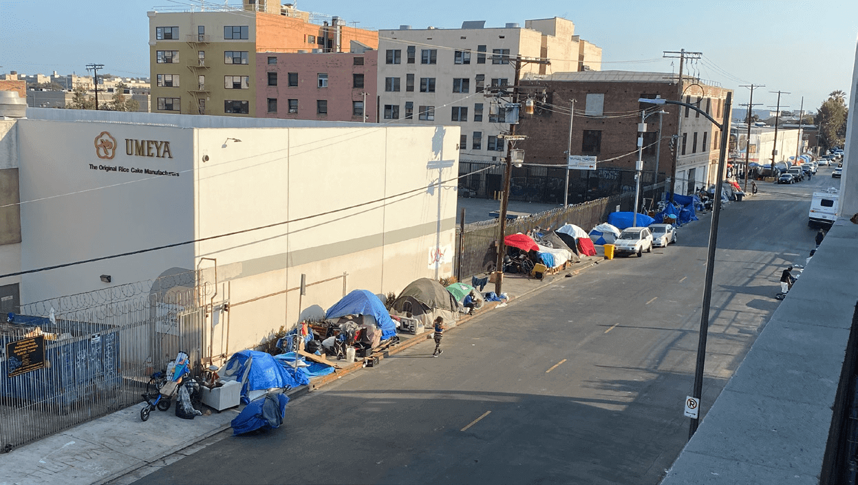
As part of a project for a real-estate client, we went to visit Mary, a woman who lived in the Skid Row area of Los Angeles. Skid Row is a district with a large homeless population and a long history of poverty and crime. But while the neighborhood was filled with graffiti, trash, and people experiencing homelessness in tents up and down the street, the inside of her home was unexpectedly beautiful. It had high ceilings, lots of natural light, and some lovely original features. Mary explained that for her, the way she felt about the building outweighed the way she felt about its location.
How did we tell Mary’s story to our real-estate clients? We boiled it down to three slides, taking less than a minute in total.

And finally we showed a quote from Mary summarizing the disparity between inside and out.
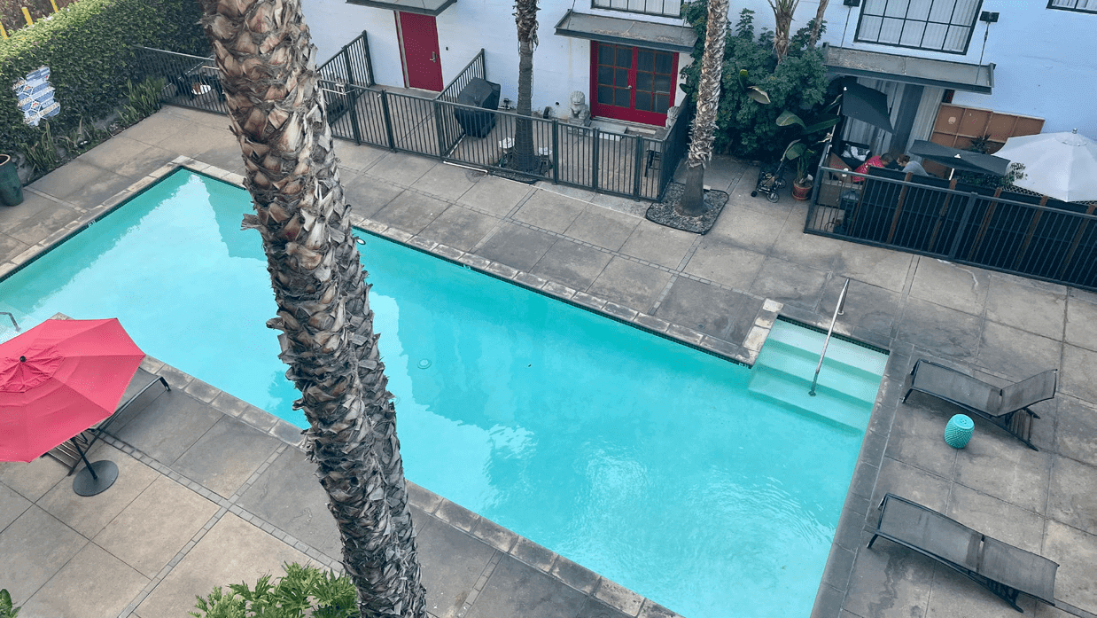
Next we told the story of Brad, who had a personal revelation while staying at home during the Covid pandemic. He and his (previously unfamiliar) neighbors got into the routine of ignoring Covid protocol and gathering by the pool, where they started to become friends. The sense of community he gained from this taught him that when he next moved neighborhoods, he should look for one that felt connected and friendly.
The way we presented Brad’s story was to say:
While explaining this, we showed a picture of the pool.
And then we leverage a quote from Brad, talking about his transition from not knowing anyone to becoming friends with them:
This is fairly typical of our visual presentation style, which is based on showing full-screen images and quotes, and no bullet points. The images and quotes are essential for conveying the realness of the stories. Of course, our clients know that the people we’re describing exist, but reinforcing this through photos, videos, and the actual words they used makes all the difference to how believable they are.
After we introduced Mary and Brad, we led a discussion about their lives and experiences. We showed additional photos and videos, and dived into the tiny details they shared with us. In Mary and Brad’s example, the insight we gave at the end of their stories was that people were looking for homes based on the vibe and emotional quality of the house and neighborhood, not necessarily just on pragmatic criteria such as square footage and cost. That’s not to say that the practical aspects weren’t important, but it was the emotional elements that were tipping the scales in favor of buying a property.
The implication for the real estate company, and part of our design suggestion, was that they could give their customers a way of browsing for properties by neighborhood vibe and other emotional qualities. We weren’t saying this was technically possible or even monetizable, only that it would give people what they really wanted. The visuals and quotes from Mary and Brad enabled us to present them as real people with real hopes and dreams; given that our objective was to inspire the executives to envision a different way of doing things, this was important. The difference between this and simply showing a set of bullet points with the same information was huge. The visuals brought the participants to life and even ended up acting as vetting criteria for new ideas: “What would Mary think about this? Would that give Brad what he’s looking for?”
You can probably imagine how important it is for us to take lots of photos and videos when we carry out field research. We want to be able to show exactly the right images to support our statements, and given that we don’t know at the time exactly what those statements will be, we have to take hundreds of shots just in case we miss the most appropriate one.
Pictures give people depth, bring out their complexities and contradictions, and bestow them with a more complete voice than words alone. They also help us to be specific. When we hear great stories our imaginations can run wild, but when we’re presenting a story which is grounded in research with real people, we don’t want our audience’s thinking to go off track. We want it to follow a precise path because we’re building a persuasive argument. Our aim is to bring our participants to life in as rich a way as possible, so that our clients can see the same things that we saw, and therefore feel the same way that we felt.
Even worse than not using visuals and quotes is to use bullet points or text summaries. Much beloved of presenters the world over, bullets cut out the most important aspect of the stories: the people themselves. They gloss over their behaviors, needs, and desires, and turn them into thin abstractions. Photos and videos make people real.
Showing rather than telling
Screenwriters and novelists have a trick they often deploy when they want to draw audiences into their stories: it’s called “show not tell.” Think of an action movie, for instance. The scenes move swiftly from one to another, jumping between different locations, actors, and strands of the story. You don’t learn everything there is to know about the characters, only what the director chooses to show you. If you’re in the audience, you’re constantly having to fill in the gaps yourself so that you can make sense of it all. The result is that you’re invested in the movie because it’s almost as if you’re a co-creator of it.
In the same way, when we present our participants’ stories we’re careful not to fill in too many of the blanks; instead, we leave this to our clients. This means that they’re able to give part of themselves to the story and feel a sense of ownership over it. And it’s partly from that ownership that the desire to help the participants comes.
It’s also essential that our clients are personally invested if they’re to progress our innovative design strategies internally in their organizations. Championing a new cause with people who don’t have the same level of understanding as you is no easy feat, and the unfortunate fact is that we can’t be by their sides forever. We need them to stay in the game long after we’ve left the project (and even while we’re still there). It’s therefore vital that they see it as their creation as much as ours.
Knowing when and how to make insight statements
When we interact with research participants in the field, we’re mainly concerned with gathering as much truthful evidence about their lives as possible. Although the odd idea might come to us there and then, and often does straight afterwards, it’s only when we have all the stories gathered together that we’re in a position to make insight statements about what they’re telling us.
An insight statement is an assertion about the data, usually expressed as an idea. Cast your mind back to our description of how we group the material from our participants, using feelings and behaviors. Eventually we generate around 40 to 50 groupings, which are all displayed on our studio wall. These groups are the results of our insights about what the meaning of the data is.
When we’ve finished with that, we can make further statements about potential solutions to the problems we’ve identified. These come as a result of a number of activities. We recall our experience of talking with the participants, we bring in what we know about our client’s industry, and we combine this with the signals that we’ve received from the market by watching their competitors. The stories now become visuals of the future, not of the past with its inherent problems. They allow us and our clients to have conversations around whether it’s even possible to do what we’re suggesting, with our participants providing the vetting criteria. It’s as if the participants give us a sieve through which we can pour our ideas, seeing which ones stick and which fall through the gaps.
Taking the example of the students who chose their majors based on factors such as what their friends studied, our insight statement about that grouping was that college students pick their majors based on a lack of understanding about the subjects and the related career opportunities, and that this often results in wasted time. It’s worth noting that although this assertion came out of the interviews we did, nobody actually said it in that way—we simply absorbed the idea from watching them. Our next assertion was: “Therefore we should find ways of minimizing anxiety for students when they pick their majors, and help them to understand that their decisions aren’t permanent.”
Throughout this whole process we work closely with our clients, from carrying out the field research, to grouping the quotes, and to making insight statements about what we’ve learned. This means that our clients have been along for the ride right from the start; if they’re not keen on progressing an aspect of the research, we can go down a different route. There should therefore be no major surprises for anyone when we finally present the stories, because everyone is already on board with the direction we’ve chosen to take.
In the next chapter we’ll look at how the generation and presentation of stories enables us to create design strategies which solve people’s problems in ways that they could rarely imagine for themselves. This is, after all, the end purpose of all the research and analysis we’ve done up to this point.


